There should always be time to learn… #Iconicdesign the first instalment! #1 Margaret Calvert
 Comments Off on There should always be time to learn… #Iconicdesign the first instalment! #1 Margaret Calvert
In this business we are often told to be forward thinking, progressive, creative, imaginative and look for the latest trend or ‘new’ style/font/colour. For the most part we do this we look at what’s popular in all areas of life, take into consideration the political and economic landscape and try to predict designs that will standout, resonate and generally work hard for our clients. It’s easy then, to ignore past designs and how they came to be.
However, having recently had my head filled by the work of the Memphis Group after a particularly irritatingly enjoyable viral puzzle, I started thinking that we should probably regularly look at the innovative designers of the past and re-visit some of those ideas and learn from them. So I thought I’d try doing a regular item on iconic design and designers. This decision also coincided with me stumbling across an old Guardian article on Margaret Calvert (she was referenced in another piece and I felt I should know the name, so I followed the trail…)

Margaret’s Stats:
Fresh out of the Chelsea School of Art, in 1957, Margaret, along with the late Jock Kinneir (her tutor at Chelsea College of Art), spent the following 6 years creating the Transport font and a series of pictograms that are now widely used throughout the UK.
Before their designs, it seems remarkable that there was no unified signage system in the UK. What we had instead was a highly eclectic and often confusing smorgasbord of signage used all over our roads. It seems incredible to think that the signs we see on the road now, were ever not in use. They are so recognisable and comforting in their familiarity.

Margaret’s typography has clearly stood the test of time, we never think of our road signs as being retro. Perhaps even more interestingly we don’t just use this style in the UK either – you’ll see the typography used in countries throughout the World.
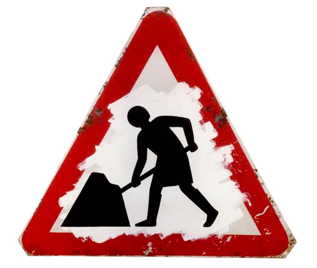
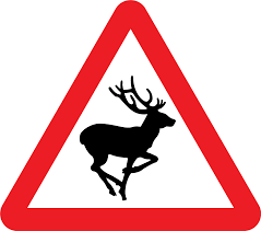
Although they may not have the glamour of other iconic British designs, it’s easy to see what’s so impressive in the pleasing simplicity of the arrows, and the surprising loveliness of the running deer.
50 years after their creations the Design Museum celebrated this incredible achievement. Fifty artists and designers, from Terence Conran to Betty Jackson, made their own signs – and Calvert herself peppered a sign with 50 bullet holes. The idea came to her after she heard that gangsters use them as target practice. “If you want to be serious,” she says, “it means don’t shoot at road signs!”
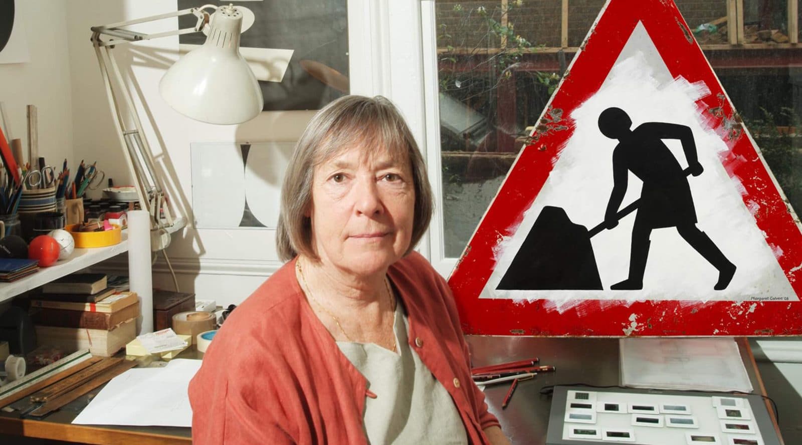
Talking at her Islington studio about how the pair chose the sky blue of our motorway signs (a recessive colour that fits well in the landscape) or the typefaces they created (two, Transport and Motorway), Calvert herself is unfailingly modest.
“We never decided, ‘Oh, let’s brand the United Kingdom’,” she says, “but as with London black cabs and red buses …” She trails off, too unassuming to continue.

At the time, neither Calvert nor Kinneir could drive, but she says this never mattered. “You thought of everything from the standpoint of: ‘What if I am at the wheel, doing speeds of over 70mph?’”
Previously, they’d worked on Gatwick airport’s signs and graphics, after Kinneir spotted Calvert’s enthusiasm at art school. Calvert would come in early on the days he was teaching, and “work intensely” on the projects he gave her. “I like the idea of designing for the larger public … Design is a service,” she explains. “The term graphic design didn’t exist then. They called it commercial art. It’s not designing from a fashion point of view, it’s purely logic, function and aesthetics. And you can’t get simpler.”