2019 Design Trends to watch out for (and those best avoided)
Comments Off on 2019 Design Trends to watch out for (and those best avoided)Reading the numerous design trend blogs and articles out there can be both frustrating, enlightening and hilarious in equal measure. You get beautiful contradictions (within the same article even), you have wonderful descriptions (that really are pretty meaningless) and you also get the lazy writers who seem to be about a year behind…
We’ve trawled through the lot to wheedle out what we think are the design trends worth taking note of. Here’s our top 5.
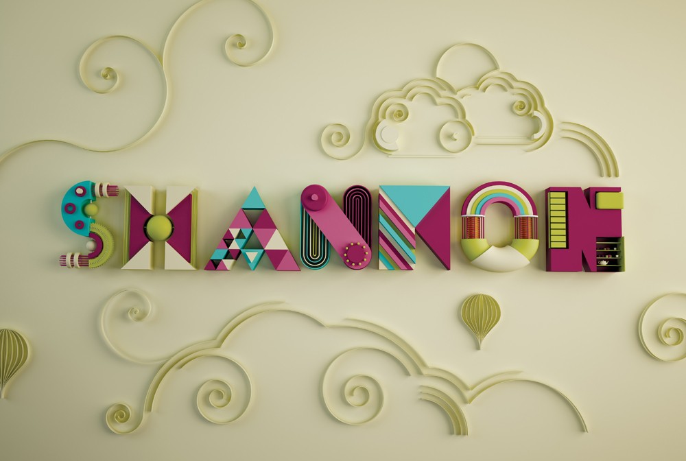
1. 3-D Typography:
This looks set to be a growing trend and one that has gone a bit extra in 2019. You may notice that letters constructed from machine parts, unusual objects or paper-cut illustrations are beginning to be used by more and more brands. Colour is also being more boldly used – think Frida Kahlo on acid. This is probably down to the rise of Maximalism and the way interior design often influences advertisers and vice-versa.


2. Papercut
It’s big using laser and paper cut methods to bring a quirky bit of life to your marketing. There’s something faintly nostalgic about the use of this technique it hints at wet Wednesdays spent at the kitchen table with all your arts and crafts materials around you in a sea of boredom-evading beauty.


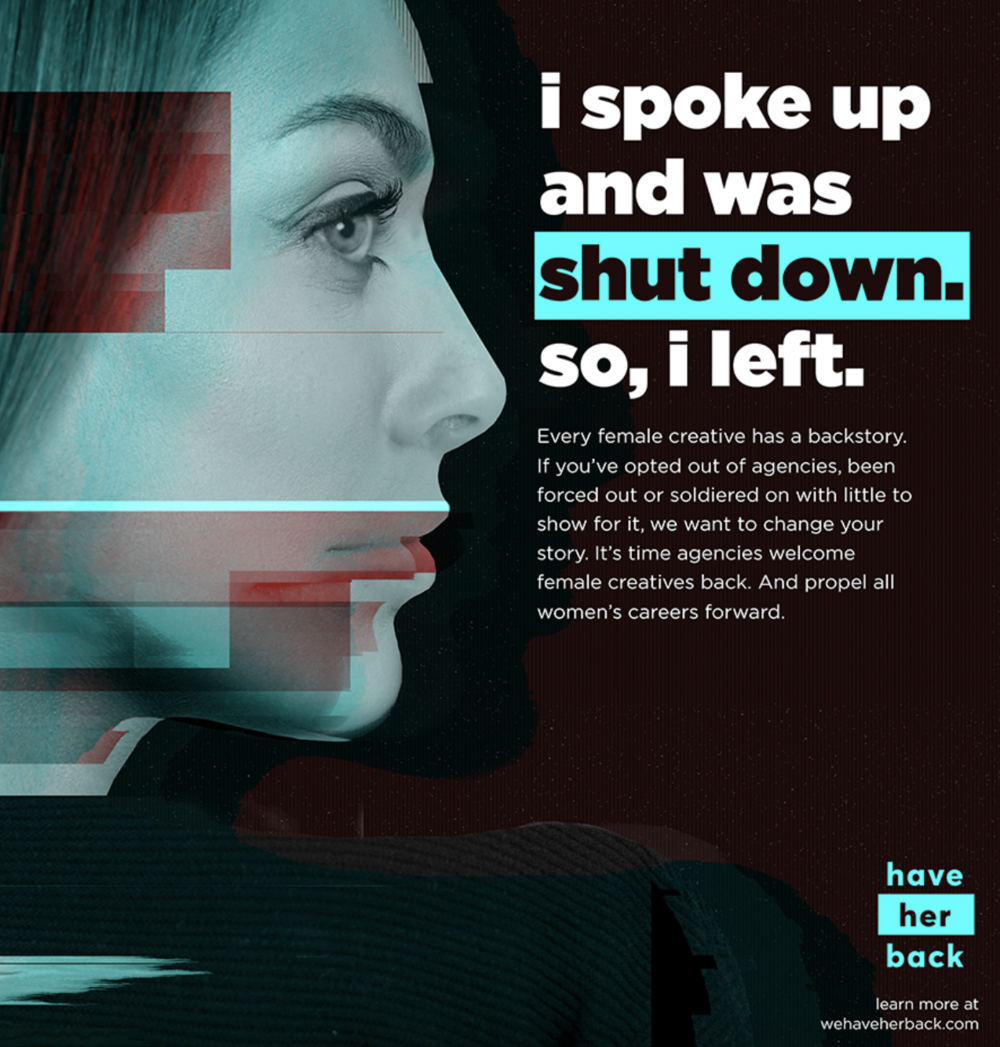
3. Women
With the growing strength of women’s voices in the media and the high profile campaign of #metoo and #heforshe to name just two of many, women are here to stay and you should expect them to be featured more in advertising in positions that buck the traditional stereotypes. AND why not! Especially when you consider the amazing achievements of people like Jasmin Paris.

4. Coral
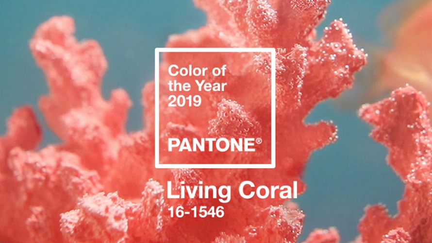
Last year it was the deeply rich ultra violet this year’s colour of choice is a coral pink – not too girly, not too millennial – and just grown up enough to last through the changing seasons. Top-tip: It actually looks pretty awesome alongside last year’s ultra violet!


AND I think if you really want to make them sing add in a minty green like this…

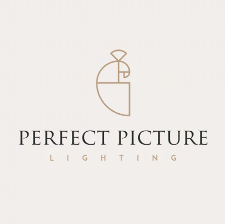
5. Art Deco your logo
So with the maelstrom of Brexit, the bouffant bedecked barmy American and a general feeling of ‘What the ACTUAL!’ It’s no wonder we look back to an age of beautiful simplistic design – clean lines, clever use of space and a hint of decadent joy. There is something truly reassuring in a brand that is confident enough to use the ‘less is more’ mantra in their logo design.
Say what!?!
What they’re saying is big… but we think may be of limited value – if you’re looking for impact:
Gradients – they were huge last year, but that’s the problem! They’re being used everywhere, so if you’re tempted to include this trend in your communications you need to think outside the box and come up with a unique spin to ensure you have standout.
Metallics – Yup, many agree that these will be big this year, but with many people actively demonstrating less ostentatious displays of wealth, along with a move towards simplicity in logo design, you’re in danger of just looking a bit too try-hard. These shiny demons are to be used advisedly and with a modicum of restraint – think Art Deco clean lines (see point five) and just a hint of antique richness